What a landing page has to do
A landing page is one page, for one audience, asking for one action. That is what separates it from a homepage, which has to welcome everyone and point them in several directions. Most landing pages that underperform are trying to be small homepages: full navigation, three equal buttons, every feature listed, proof hidden in the footer. Each extra choice is a small cost to the visitor, and those costs add up before they reach the button. My job is to remove everything that does not move the visitor toward the action, and to make what remains clear enough that the decision feels easy.
The seven sections every landing page needs
Hero: the promise in one line
A headline that says what the visitor gets, a single subline that makes it concrete, one primary button and one piece of evidence. If the first screen does not make sense without scrolling, the rest of the page is working against it.
Problem: what it costs to ignore
A short, specific description of the situation the visitor is in. Written in their words, not yours. This is where people decide whether the page is about them.
Mechanism: how it works
Three steps, a short demo or the product itself. Show how the promise is delivered, so the offer feels real rather than hopeful.
Proof: evidence, not adjectives
Named quotes, real screenshots, results with a source and a date. Proof placed before the ask reads as confidence; the same proof in a footer reads as an afterthought.
Offer: what you get, exactly
What is included, what it costs or what happens next, and how long it takes. Vague offers create questions, and questions delay decisions.
Objections: the five real hesitations
Price, time, risk, fit and trust. Answer each one plainly, usually as a short FAQ, before the visitor has to leave the page to find out.
Close: one action, one button
Repeat the promise and the action. One button, with any alternative shown as a plain link so it never competes with the main path.
Landing page layouts that convert, and why
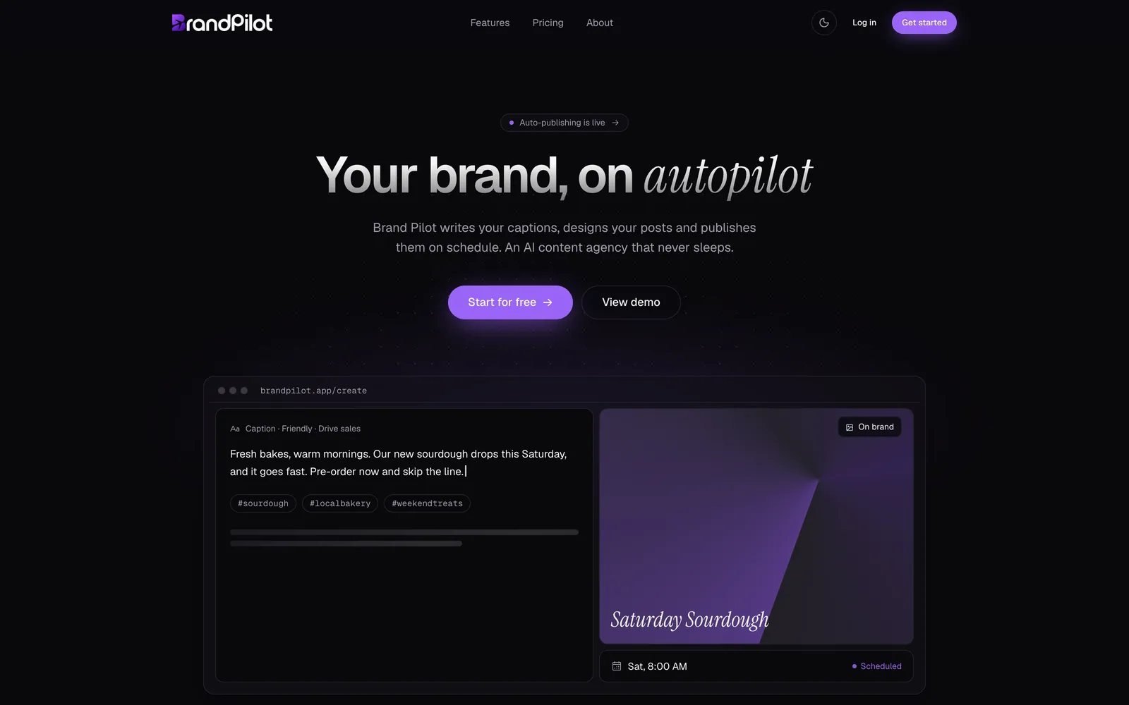
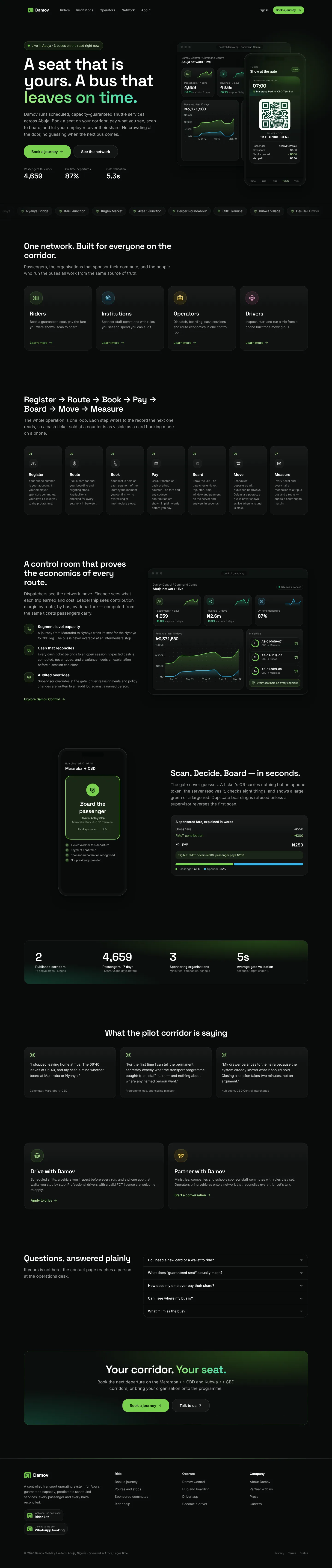
The layout should follow how your offer is best understood. A centre stack (one narrow column, message then proof) suits offers that can be explained in a sentence and products that are not very visual. A split hero, with copy on one side and a working tool or live product card on the other, suits products that can be demonstrated in a single interaction; the BrandPilot site uses this pattern, showing a caption being written and scheduled before any explanation. A product-as-hero layout puts the interface on the first screen and keeps the copy short, which works when the product itself is the strongest proof. Choosing the layout is a strategy decision, not a style preference, and it is made before any visual design starts.
Copy first, design second
Landing page design that starts in a design tool usually ends with copy squeezed into boxes that were drawn for placeholder text. I work the other way around. The message, the order of the argument and the exact wording of the button are written first, then the layout is designed to carry them. This makes the page shorter, because every section has to earn its place in the argument, and it makes testing easier, because you can change a headline without breaking the design. If you already have strong copy, I will use it. If not, I write it with you.
What you get
- Copy for every section, written around the one action the page exists for.
- A responsive design for mobile and desktop, built from your brand identity.
- A fast, indexable build with clean HTML and optimised images.
- Your form connected to email or your CRM, with spam protection.
- Analytics events on the main action, so you can see what the page actually does.
- An optional A/B variant of the headline or hero, when you have enough traffic to test it.
How a landing page project runs
- 01
The one action
We agree the single action the page exists for, who it is aimed at and how success will be measured.
- 02
Message and structure
I write the argument section by section, from the promise in the hero to the close, before any visual design.
- 03
Design
The page is designed on mobile and desktop around the copy, using your brand identity.
- 04
Build and wiring
A fast, indexable build with the form connected to your inbox or CRM and analytics on the main action.
- 05
Launch and learn
We go live, check the numbers after the first traffic arrives and adjust the headline or proof where it helps.
Every project follows the full design and build process, from brief to handover.
What it costs and how long it takes
A designed and built landing page starts from $600 on the rate card. The Launch package (from $700) adds a logo and mini brand kit, which is a good fit for new ideas and waitlists. Most landing pages take one to three weeks, depending on how much copy and proof already exists.